
3 Essential Tips How To Evaluate Your Sales Team Performance
If you are a sales leader, sales manager or a sales analytics professional, one question that you will need to answer is who are your best salespeople and who are the worst ones. It is not a straightforward task to tackle, and the situation in your company will profoundly influence it. That being said, in practice, one “straightforward” solution is very often used in the form of traditional sales leaderboard. We all love Leaderboards, don’t we? However, are they really the right tool for ranking of your salespeople?
I will argue that although there is nothing wrong with a leaderboard as such, it is misused in practice. The main problem is not the leaderboard itself but metric that is used in it. I will suggest three alternatives which I find more appropriate.
To illustrate my tips with examples, I created data for a fictional sales team. I will use it to visualize each approach. To provide you more background, let’s say that these guys are members of a sales team in a company that produces toys. To give you more context, let’s say that these guys are members of a sales team in a company that produces toys. They focus more on “farming” than “hunting” new customers.
What Is Wrong With Your Traditional Sales Leaderboard
The attractiveness of leaderboards is that they are simple to create and simple to interpret. Just take one or few core metrics you use in your sales team and rank your salespeople from the one with the biggest value to the lowest. It can be revenue, units or incremental profit or several different core metrics at once.
Sounds pretty straightforward, right? So what is wrong with that? As I said at the beginning, I don’t think the leaderboard itself is the issue. The problem lies in the metrics that do not take into account at least some basic evaluation of the potential of assigned territories or assigned client portfolios.
In an example below I designed simple leaderboard for our fictional sales team with Revenue as the only metric.
Traditional Sales Leaderboard Example
| Nickname | Revenues | Rank |
|---|---|---|
| Buzz | 1,500,000 | 1 |
| Woody | 1,400,000 | 2 |
| Shark | 1,000,000 | 3 |
| Rocky | 900,000 | 4 |
| Robot | 800,000 | 5 |
| Mike | 750,000 | 6 |
| Dolly | 600,000 | 7 |
| Slinky | 600,000 | 7 |
| Rex | 500,000 | 9 |
| Lenny | 450,000 | 10 |
| Snake | 400,000 | 11 |
| Troll | 400,000 | 11 |
| Etch | 230,000 | 13 |
| Hamm | 170,000 | 14 |
| Wheezy | 50,000 | 15 |
| Jessie | 0 | 16 |
Nice and easy, but what does this leaderboard actually tells you? It tells you that Buzz sold toys for most revenue, but it is not what you want to know. What you want to know is who is your best salesperson not who achieved the biggest revenue.
It might be tempting to say that salesperson who has the biggest revenues, volumes or units sold (Buzz in our example) is the best one. In most real-life scenarios this easy solution will fail because “potential” of assigned territory or portfolio will heavily influence it.
In fact, a leaderboard with traditional sales metrics like revenue, volume or even incremental net income tells you which of your salespeople is the luckiest to be assigned the juiciest territory or portfolio. Do you really want to celebrate or reward people for this?
There are situations where this traditional leaderboard might work. For example in a rare case of very similar assigned territories/portfolios with similar potential, it might be a viable option. Another reason why you might use it is the simplicity when you do not have enough data or sales analytics capacity, and you need something for the beginning to start with. That’s fine, just make sure it won’t become a permanent solution.
Another situation where it might be fine to use traditional leaderboard is when you’ve already taken potential into account in your sales targets, and you rank salespeople based on quota fulfillment, not absolute sales. In that case, if you allocated targets centrally based on your potential “driver” to individual salespeople and are not reallocating them after that, you are already doing what I will suggest as a tip #1.
Tip #1: Fix Your Leaderboard By Taking Into Account Territory/Portfolio Potential
If you want to rank salespeople really by how good they are at selling and mitigate at least to some extent how lucky they were to be allocated good portfolio or territory, you need some other tool than traditional leaderboard.
Good news is that we can adjust the Leaderboard to take into account potential. What you will need to do is quantify the potential of assigned territory or portfolio. It might be as easy as a number of customers, or as complex as a machine learning model that will take into account more variables of potential. My main advice here is, do not make stuff up about what you think or “feel” is driving the sales performance but use your historical data. At least to confirm that your hypothesis is valid. Metric you should use have to be the core driver and predictor of your sales team performance. Otherwise, you are just speculating and making stuff up.
Portfolio size is one potential performance driver that you should consider, and I will use it in my example as the only one. In real-life you will have to look at other drivers that might influence the results. It might be a number of potential customers, their revenue or purchasing power. It will be very dependent on your business and product.
See the leaderboard below, that I adjusted based on a number of clients in a portfolio of each salesperson. It is still leaderboard, but at least it measures the performance of your salespeople, not the size of the territories. For example Buzz, the salesperson with the biggest revenue is not in the lead anymore and fell to the third place because Woody and Mike were able to utilize their smaller portfolios better. Woody was among top performers even on the traditional leaderboard but based on revenue per client metric he is far ahead of everybody else.
Another interesting difference in both leaderboards is Mike who jumped significantly up because the potential of his portfolio is considerably smaller than for examples that of Buzz or Rocky. In traditional leaderboard, he was hiding in the middle of the field. Adjusted leaderboard tells you that he is one of your stars an was just unlucky to be assigned smaller portfolio.
Adjusted Sales Leaderboard Example
| Nickname | Revenue | Revenue Rank | Assigned # of clients | Revenue per client | Revenue per client Rank |
|---|---|---|---|---|---|
| Woody | 1,400,000 | 2 | 378 | 3704 | 1 |
| Mike | 750,000 | 6 | 322 | 2329 | 2 |
| Buzz | 1,500,000 | 1 | 649 | 2311 | 3 |
| Shark | 1,000,000 | 3 | 534 | 1873 | 4 |
| Robot | 800,000 | 5 | 567 | 1411 | 5 |
| Dolly | 600,000 | 7 | 453 | 1325 | 6 |
| Slinky | 600,000 | 7 | 454 | 1322 | 7 |
| Rocky | 900,000 | 4 | 786 | 1145 | 8 |
| Rex | 500,000 | 9 | 456 | 1096 | 9 |
| Lenny | 450,000 | 10 | 455 | 989 | 10 |
| Troll | 400,000 | 11 | 435 | 920 | 11 |
| Snake | 400,000 | 11 | 544 | 735 | 12 |
| Etch | 230,000 | 13 | 454 | 507 | 13 |
| Hamm | 170,000 | 14 | 400 | 425 | 14 |
| Wheezy | 50,000 | 15 | 300 | 167 | 15 |
| Jessie | 0 | 16 | 0 | 0 | 16 |
Tip #2: Visualize Sales Performance vs. Salespeople Seniority
For analyzing your sales team results, even the adjusted leaderboard is not enough. We can squeeze far more insight from the data by visualizing it in different ways.
One approach I highly recommend is to show results in a context of how long is the salesperson in your sales team. Mainly in case if ramp-up period of your salespeople is longer. You can do this by calculation your median (or average) rump-up curve and compare sales results (ideally adjusted for portfolio potential) with your ramp-up curve.
The data visualization below displays our fictional sales team. It shows that although Jessie is the weakest salesperson, she is on track. At her seniority level, making no sales is actually expected. On the other hand, her other two junior team members Wheezy and Etch are slightly below what we expect from median salesperson of their seniority, and it is precisely the situation where you should investigate what is going on. Is it a training, sales manager or some other reason?
The worst salesperson based on his distance from ramp-up curve is Hamm. Notice that both previous leaderboards I showed you above say that he is just the third worst salesperson because he was hiding among more junior colleagues.
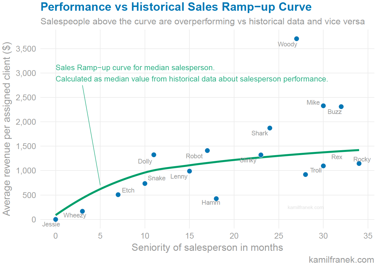
I assume there is no seasonality in sales results of toys just for the sake of making these examples easier to follow. If you want to use this approach, you will need to use seasonal decomposition techniques to strip seasonality from each salesperson sales. Otherwise, it won’t be comparable to your ramp-up curve which is seasonally adjusted already.
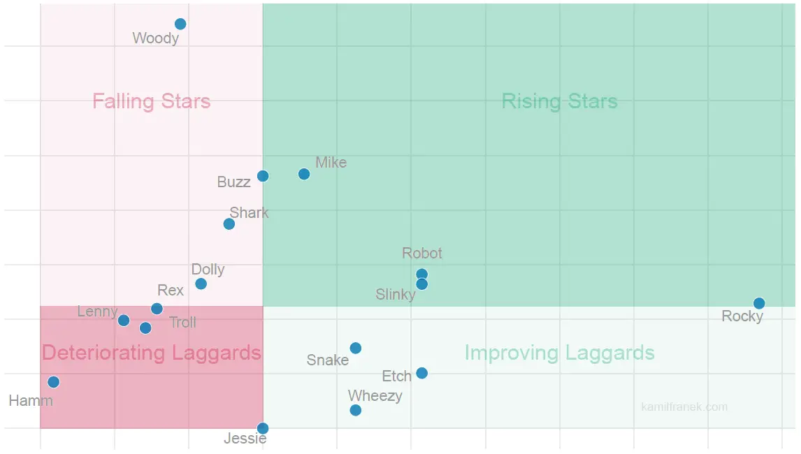
Tip #3: Visualize Your Sales Team Performance vs. Performance Dynamics
Another way I recommend is to visualize performance compared to trend. Are your top salespeople getting better or worse? An excellent approach to visualize this is to compare performance adjusted for potential as one dimension to growth in this metric in time. You will get matrix similar to the one below You can see both which of your salespeople overperform and also if they are getting better over time (or worse).
What I particularly like about this visualization of your sales team performance is that it helps you to identify the main areas to focus on.
Focusing on your falling stars to identify potential performance problems as soon as possible is more important financially than concentrating on your weak performers.
You do not need to spend too much time focusing on salespeople who are getting better vs. previous periods. However, people who are deteriorating should catch your attention, mainly if they are one or your current sales stars.
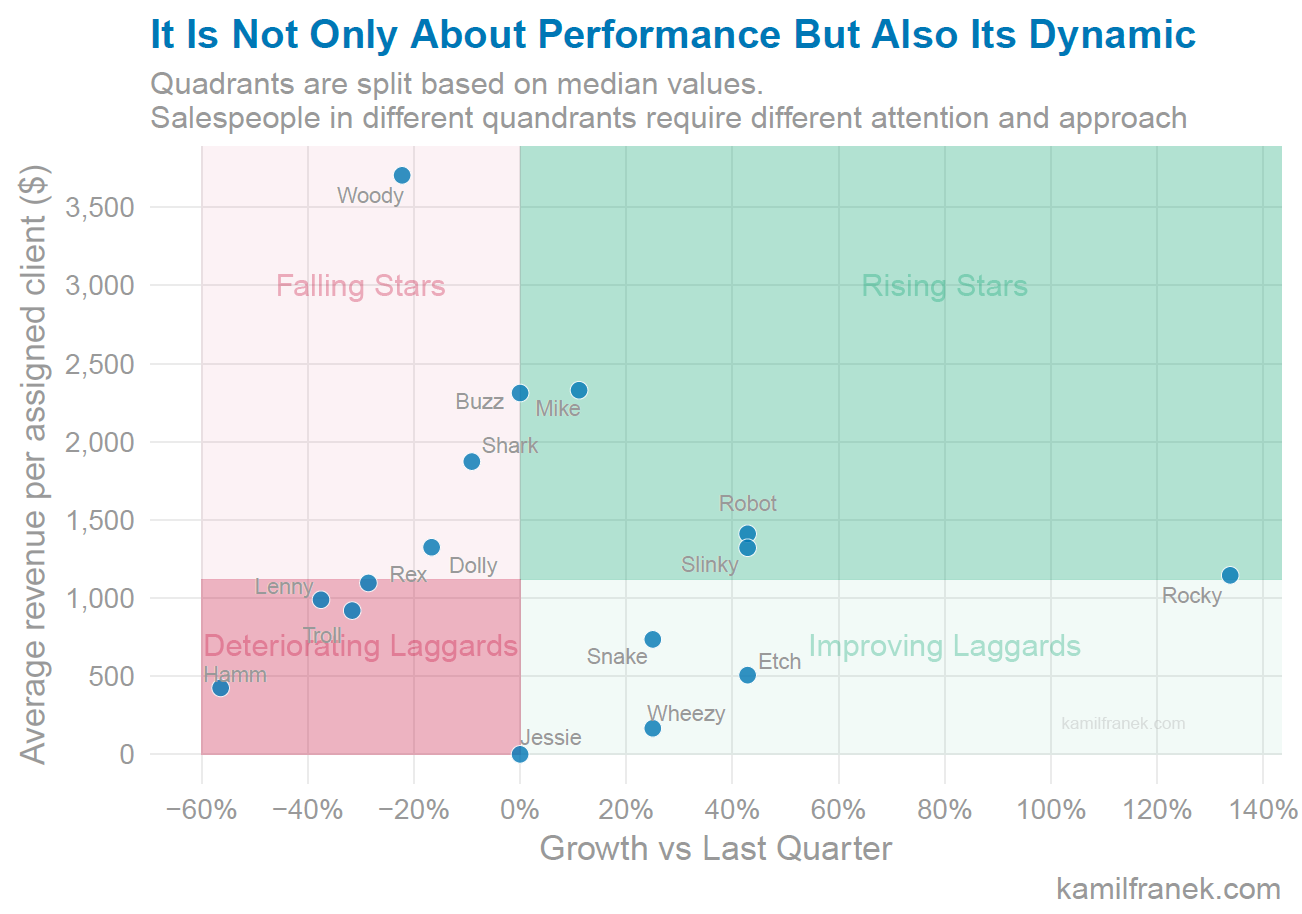
What does the chart above tell us about our fictional sales team? It shows us as in the previous visualization that Woody is your best performer after adjusting for portfolio potential, but he still should get more sales management attention than Rocky or Mike. Yes, Woody is selling more than they are right now and earning more money for his company but his sales are decreasing over time. This should alert his sales manager to find out what is happening. Better sooner than later. This visualization also shows that all our junior salespeople (Jessie + Wheezy + Etch ) have a good growth trajectory. On the opposite scale of deteriorating salespeople is Hamm in the red quadrant. He is the worst performer, and his sales manager need to have some serious discussion with him.
What’s your preferred way how to rank your salespeople? How would you visualize their performance? Let me know. I would love to hear your view.
References: Charts in this article were created using R and ggplot2.