
How to Visually Redesign Your Income Statement (P&L)
“Income statement” or also called “Profit & Loss Statment (P&L)” or “Consolidated statements of operations” is an essential way how to look at your business. Together with the Cash Flow statement probably the most important one. Income statement gives us a high-level overview of how much money did a company, product line or customer segment make in the last quarter or year and compare it with previous periods.
How Income Statement (P&L) usually looks like
Unfortunately, the most common way how an income statement looks today is similar to this:
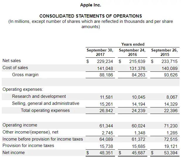
What do you think about it? Do you see what is happening in different years? What are the main takeaways? Is net income growing or decreasing? What are the primary drivers of net income change? What is a proportion of expenses to revenue?
All answers to these question are in there, but I find this table format extremely unhelpful for a quick overview of what is happening with the company. It is also pretty bad for communicating these data to broader business audiences. I picked Apple Inc. as an example, but you would find a very similar format used for other companies. Since we are talking about the core statement that every company produces, I think income statement deserves a redesign and waterfall chart is a great data visualization technique to show this type of information.
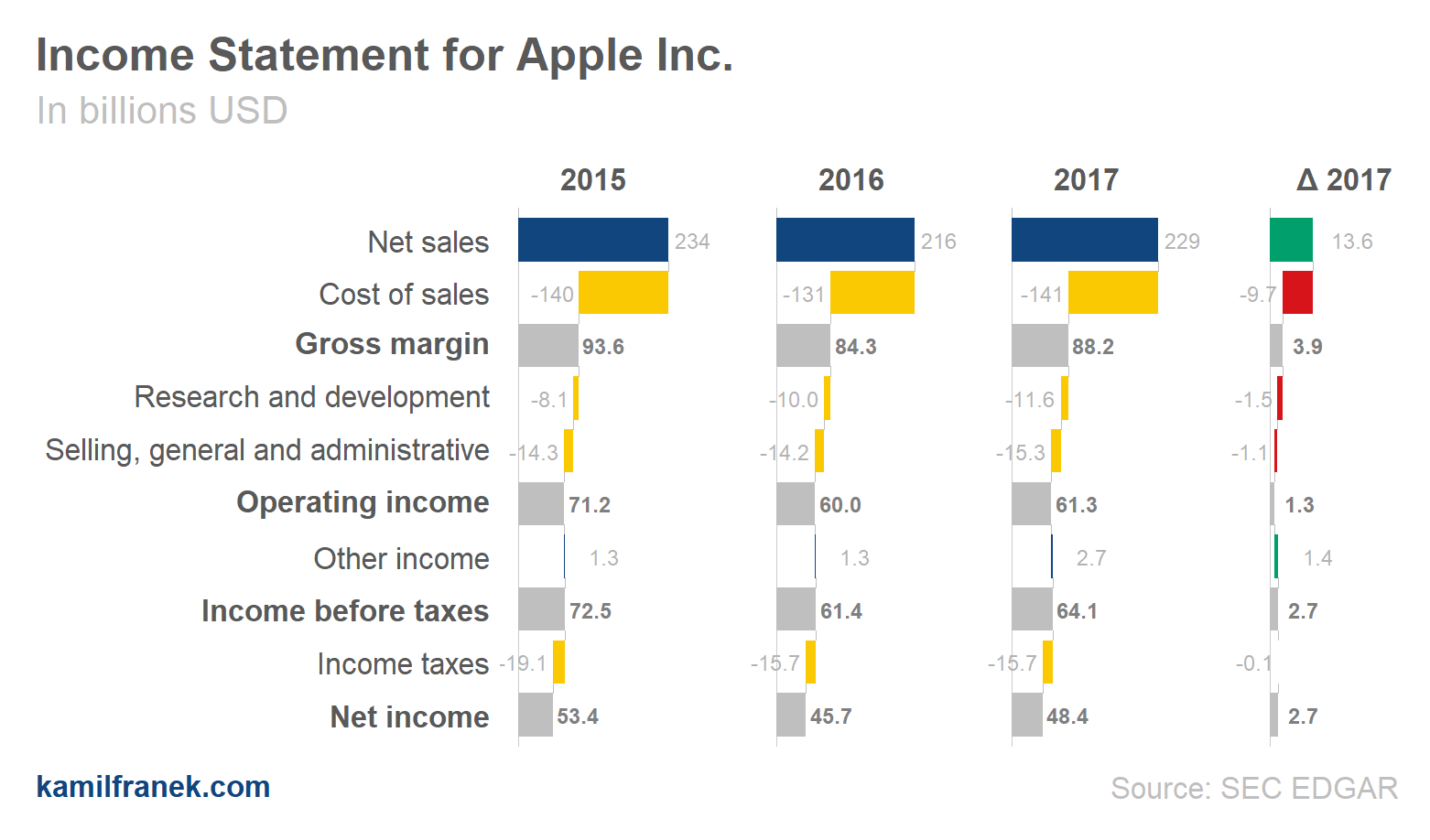
How to humanize income statement (P&L) - raw version
Look at the charts below where I took the same numbers from the table you saw before and showed it as a basic waterfall chart. It is just a raw version that has some flaws that I will tackle later in this article, but I’m confident that this visual representation better communicates what is happening with Apple Inc business.
Waterfall charts are especially useful for showing proportions of different income statement (P&L) items to each other and how they contribute to the bottom line.
In the data visualization below, you can see what is driving Apple net income and proportions of different P&L items. You can also see where you started (revenues) and where you ended (net income) and which items are substantial and which ones are immaterial.
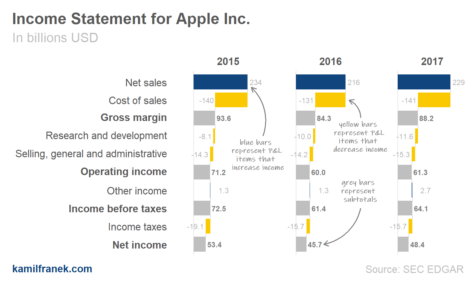
The waterfall chart for Apple shows that a significant proportion of revenues is left as profit after costs are deducted. As you are going to see later when we look at more companies, these profit margins are enormous. The problem is that if you look at how various years results differ, there is not much of a difference.
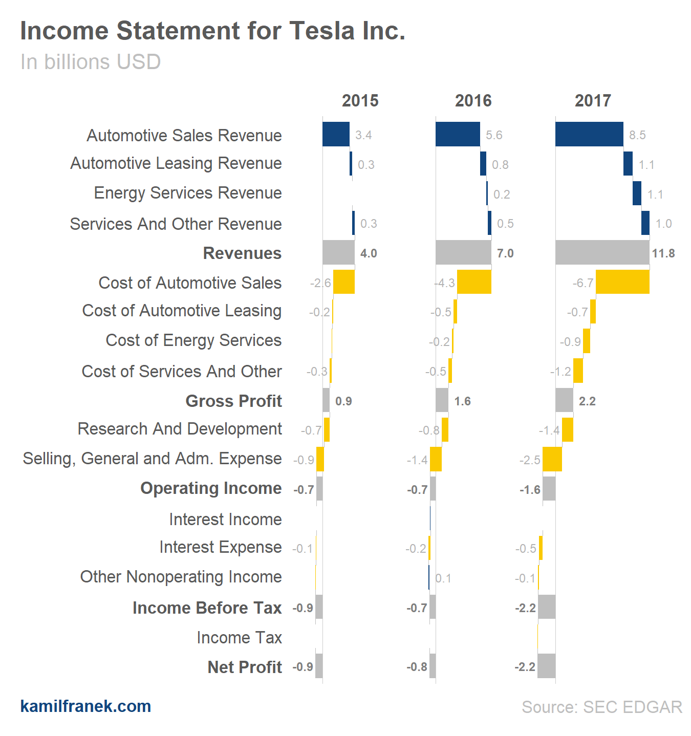
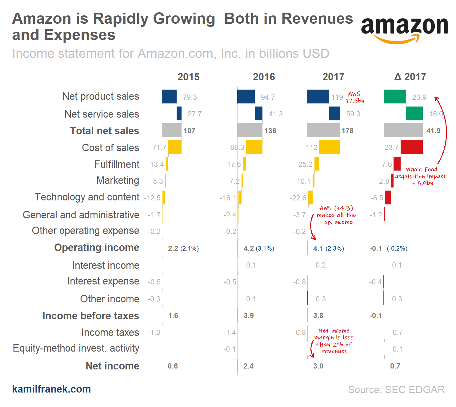
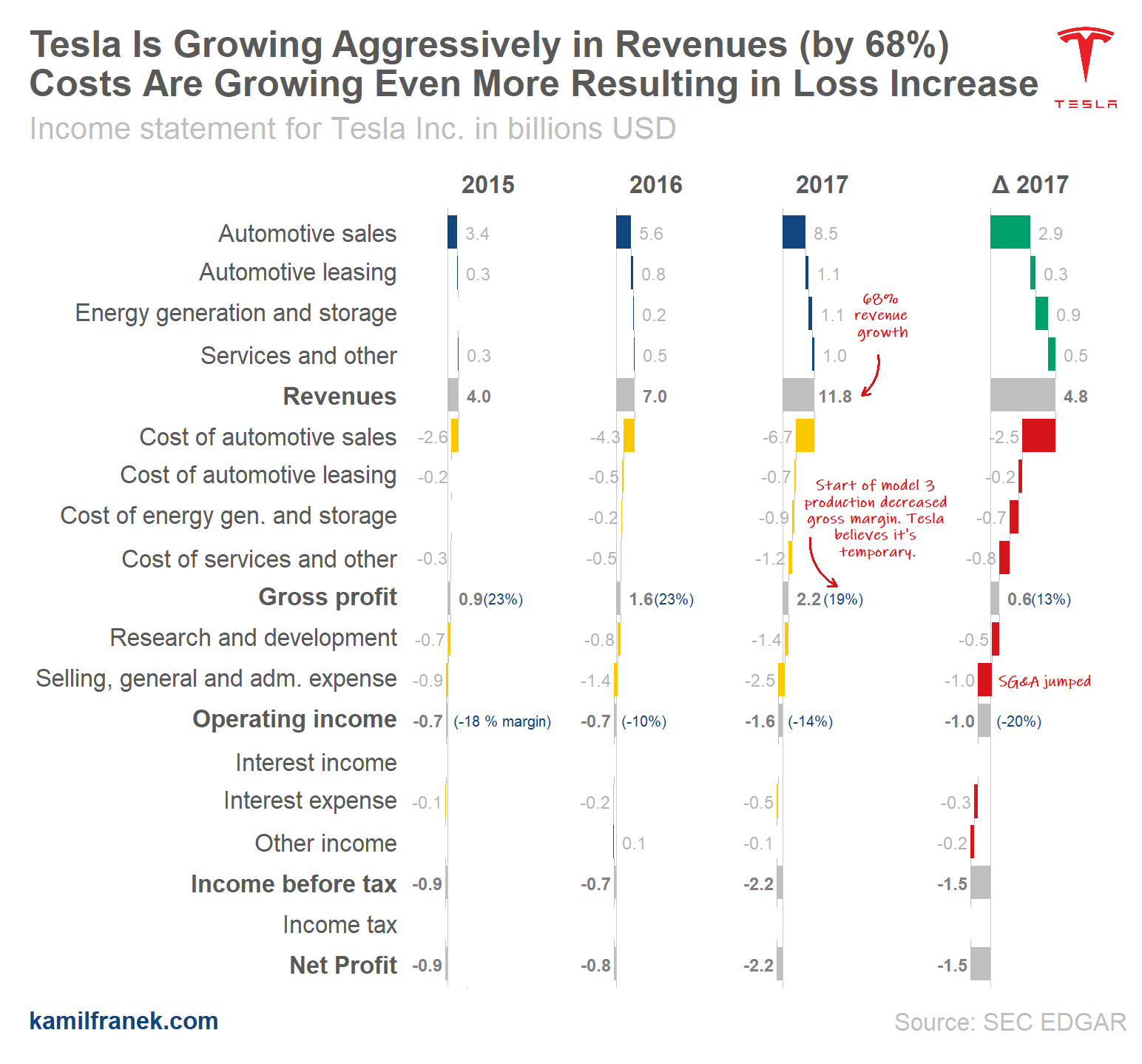
In the second chart below (showing Tesla) both revenues and costs increase each year significantly. Comparing Tesla to Apple is like comparing Apples to Oranges because they are in a different growth stage. So far, Tesla is losing money and as you can see Tesla managed to spend all incremental revenues in 2017 and even something on top of it.
In case you are not familiar with waterfall chart, think about it as usual P&L table where rows depict core P&L items and instead of numbers you have them visualized by bars. These bars have their length proportional to the underlying number. One core feature that makes the waterfall chart what it is is that bars do not start at zero for each item, but they start where the previous bar ended. So each P&L line(bar) is added or deducted from the previous one.
In charts in this article blue represents items that are increasing net income and yellow represent items like expenses that are decreasing net income. Grey bars are subtotals of core items.
Overall, the waterfall chart is a very helpful tool. From my experience, whenever some executive struggled to understand why specific numbers decreased/increase, the best way to explain it to them quickly was the waterfall chart. Why our costs increased by so much this year? What is driving it? Why our revenues dropped? It is super clear, and even MS Excel provides this chart type nowadays.
Why should we care about this? Is it worth the effort?
Analytics revolution that started years ago is not only about machine learning models and artificial intelligence. It is also about data visualization.
There can be a significant positive impact on business just from taking data that you already have and visualizing it in a way that makes the right people understand it more efficiently. Only when people understand something, then they can use it in their decision making or idea generation.
So why are we still seeing boring table style income statements with comments hidden somewhere in fine print that nobody reads? I think it comes down to data visualization literacy. Despite immense analytics & visualization developments in recent years, people tend to do things the same way they have always done it. However, this is fortunately slowly changing, and companies that are not going to adjust quickly will pay the price in lower productivity.
Also, tools that analytics & finance teams have available are not comparable to what we had ten years ago. There is no excuse for not trying to humanize P&L statements and make it easier to understand. The aim is to make sure that business people (not only people from finance that prepare it) use it and understand it.
It is just common sense. If we want users of P&L report to understand it, we have to invest energy to making it user-friendly the same way as the same companies invest money in UX design to make their products user-friendly for their customers.
Otherwise, customers won’t use it. It’s that simple, more effort has to be put into the design of these things. Especially finance department that is in charge of putting P&L together has to realize that they are not creating these report for themselves and therefore they have to look for new ways to communicate these crucial data to other business users and drive this change.
There are many different P&Ls within each company
Before I jump into tweaking raw waterfall chart that I showed you earlier, I want to stress out that although examples I will use in this article are income statements of whole companies, this approach is not limited only to companies P&L.
The main strength of this approach is when you use it on much more detailed income statements of different product lines and customer segments within your businesses. Time periods will be probably monthly not annual as in my examples.
You can look at Income statement at different levels:
- Company: I will use this approach in my examples because that data is publicly available. However, I believe there are better use cases within business analytics.
- Regions: Compare income statement for different countries or regions based on how your business is organized.
- Customer segments: Use it to have an overview of the profitability of different customers segments.
- Key Customers: For more significant customers that make junk of your revenues, it makes sense to look at TOP customers individually.
- Product lines: Having profitability split by product is also very important at least as an additional view.
It is not about choosing one view. You will need to look at it from different angles. They all have their value.
So when you go through examples for publicly traded companies that I’ve put together, think about how it can be applied to the product line and customer segments in your business. Similar to companies I use in my examples, your product line or customer segments will have different margin levels and different growth dynamic. Some of them can be loss-making because you are starting something new (as in the case of Testla Inc example). Some of them will be high margin & lower growth similar to what you can see in Apple Inc.P&L.
3 tweaks to extract more value from waterfall P&L chart
The basic waterfall examples that I showed earlier for Apple and Tesla, were missing some significant but straightforward adjustments that can increase its usability. I did not use them earlier because I wanted to make sure that in a raw version I visualize only the numbers that I showed in table format example.
Raw version allows to compare income statements items between each other and also to compare different companies (or segments) very well. But just with few changes, we can make the waterfall chart even more valuable.
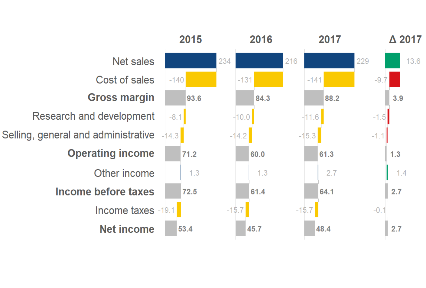
Tweak #1: Comparing vs Last Year Period (Incremental Waterfall)
As you probably noticed when you were looking at an example of Appl Inc. earlier, waterfalls for all years look similar because the company was relatively stable in all items across all three years. Changes were not relatively large, but for a company like Apple, these small relative differences are huge in absolute terms. You can see if we are growing and how much from the labels, but that is not ideal and we want to make the differences stand out more.
One way, how to tweak this chart to show more explicitly difference between periods by ading column that will show differences between years. This approach would work and is usually used also in traditional reporting,but since we are working with waterfall charts, why not to show differences in waterfall too? To make it happen, we will have to use different scales on a horizontal axis for the new incremental waterfall. I will also use different colors to indicate that this waterfall has different scales. Otherwise, bar that show changes would be too small to differentiate visually. To focus on the last year, I will show only 2017 vs 2016 changes.
The example above shows how the “incremental” waterfall helps to see what happened between periods. You can read it from the bottom to see that net income increased by 2.7m and go up to see why. Or you can start with revenues and go downwards. Revenues were growing but so were expenses and in a much more quicker way. Therefore although Apple is a company with relatively high margins, margin decreased in 2017 vs. 2016 because they added more expenses relative to incremental revenue and operating income increased “only” by 1.3$ bn. What saved net income slightly was “other income” line.
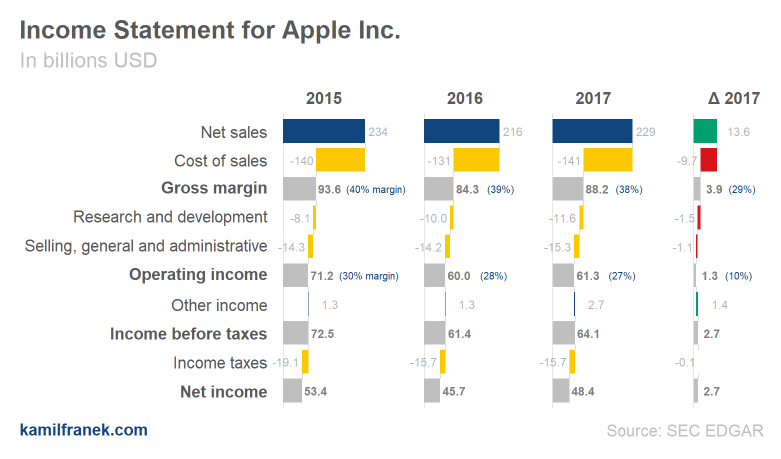
Tweak #2: Add Labels with Margin as % of Revenue
The second change that will take just a small effort and make a significant impact for users of an income statement is adding margin percentages. If there are substantial changes in margin, you can obviously see that in a relatively lower size of operating income or income vs revenues. However, it is hard to see more subtle changes vs last years. When I “read” the chart or any profit & loss statement I tend to calculate margin % in my head anyway. I am interested both in % in given years but also in incremental operating margins. So I think it is necessary to add them to our chart.
Question is how to do it. In this case, I think that just labels next to the value should be enough to avoid the cognitive strain of calculating these margins in your head. People can then concentrate on making other observations. As was explained in great Kanhenman’s book “Thinking, Fast and Slow”, if your brain has an excuse not to think too hard it will take it, therefore if we want people to notice margins we have to make them explicit.
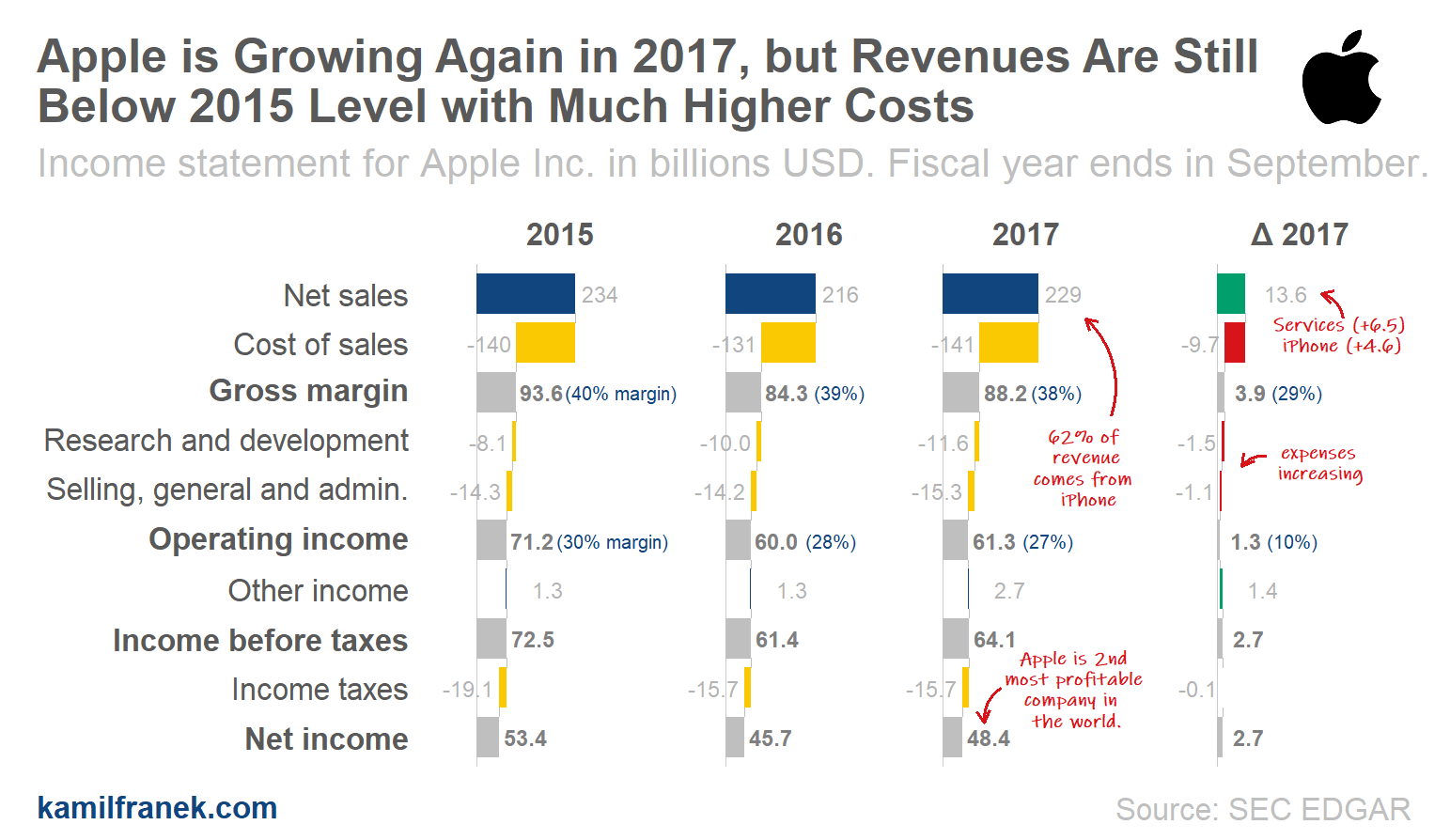
Tweak #3: Put Core Comments Directly in the Chart
Every P&L have some core developments you would like people to see and notice. Adding commentary below the chart where you explain the main takeaway will probably do the job, but I think these type of comments are more suitable for more detailed explanation and less important stuff.
The core takeaway should be evident from the chart, and we probably need to be more explicit. It is not a very good idea to assume that things do not need comments because anybody “must” have noticed it.
The takeaway heading is one way how to communicate your main point, and if you want to point specific change or item, then direct comments in the chart seem to me like the best option. See the examples below.
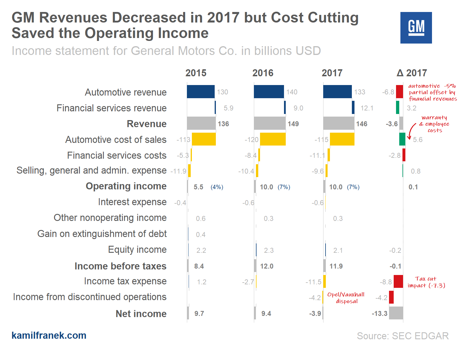
Puting It All Together: Income Statement Visualization for Four Publicly Traded Companies
Here you can find several complete P&L visualizations of publicly traded companies that include all tweaks. When you go through them, keep in mind that this is only one of many ways how you can use this approach and that you can use it for the same analysis on internal business data. Just imagine product lines, customers segment, regions or even individual customers instead of companies.
What is missing?
Waterfalls charts are great for an income statement visualization, but they have some disadvantages too.
One of them is that trend is not so clear from the chart unless there is extreme growth or decline between different periods.
Another problem is that having one waterfall for every company or segment makes the comparison between them quite clumsy. I would like to see some additional chart added to these waterfalls for more high-level comparison of different customers/clients/segments/products on various metrics. Waterfalls are too granular for this and not right visual form for this comparison.
Also if you are looking at the income statement, you probably would like to see also other core financial statements for the same company. Cash Flow statement is the easy one because you can use the same approach that I used in this article for the income statement. The balance sheet would require a different approach than waterfall charts.
Stay tuned, I will try to tackle some of those challenges in one of my future articles. In a mean time, I would love to hear your thoughts about what approach do you use for income statement visualization in your business.
References: Visualizations in this article were created using R and ggplot2.